

Arial. Times New Roman. Comic Sans. Helvetica. Futura.
Familiar names, and even more familiar typefaces – or fonts, as they’re more commonly mistaken for.
To be clear, a typeface refers to a family of related fonts (take, for example, Arial), and a font refers to a particular weight, width, and style within that type (such as Arial Regular, Arial Bold, Arial Italic, etc).
While this might not be something everyone knows, it’s crucial for those with a budding interest in designing typography.
Just like how architecture students are teased for needing to touch architecture that intrigues them or how music students will judge each other when playing their respective instruments, there are only certain things you’ll come to understand when you’re deep in the trenches of the subject.
For Nicole Rauen, that was typography.
Rauen might have started out as an architect, but her interest and passion for designing typography was right around the corner. Source: Nicole Rauen
The interconnectedness of art and how to make the best out of it
Hailing from Brazil, Rauen’s discovery of her passion for typography didn’t begin until later in her career.
Growing up, Rauen’s interest in the arts began when she joined her parents at decoration showcases and interior design-related events.
“I used to love to go to them,” she says. “I wanted to see the spaces and understand how the space worked or was used.”
By the time she was in her last year of high school, Rauen decided that architecture would be the path she’d pursued for her studies.
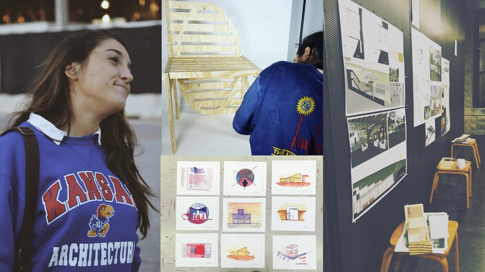
The first two years of her Bachelor of Architecture were spent at Brazil’s Pontifical Catholic University of Rio Grande do Sul. In her third year, she scored a scholarship to the University of Kansas in the US, and it was off across the ocean she went, ready for a completely different learning experience.
“I really like the creative process surrounding architecture, but the programme in Brazil was more related to the engineering side of things,” explains Rauen. Back home, architecture focused on engineering and construction, and Rauen realised that it wasn’t where her interests lay.
Luckily, her time in the US reignited her love for her programme. There, the course focused more on conceptual architecture, emphasising ideas, creation, and the arts – things Rauen was keen to pursue.

If you think you’re losing passion for your programme, maybe it’s time to look at the work from a different angle. Source: Nicole Rauen
“I remember in Brazil, the main questions my professors would ask were, ‘How are you gonna build it? How you how the door is gonna fit?’ and you’ll need answers like ‘A few centimetres to the left,’ or ‘The door will open here.’” shares Rauen.
“But in the US, my professors would say, ‘Let’s start with watercolour to try to express our project with circles today.’ I love that – it was a nice way to open your mind in different ways.”
This creativity was something she explored during an internship after her studies too. The studio Rauen was attached to was heavily involved in conceptual architecture competitions, and she spent most of her time designing those projects instead.
But at the end of the day, she still had to leave it all behind when she returned to Brazil to finish her degree.
At that point, architecture no longer had its initial pull for her. With that realisation well underway, Rauen, who wanted a break from architecture with hopes of returning to it one day, applied for a bachelor’s in design at the University of Vale do Rio dos Sinos Campus São Leopoldo.
The university’s diverse design curriculum exposed its students to different design industries each semester. From product to materials, branding, and more, it allowed Rauen to build and sharpen her skills while figuring out her favoured field.
That said, with enough time spent on graphic designing and an internship focused on branding, Rauen eventually discovered the world of lettering.
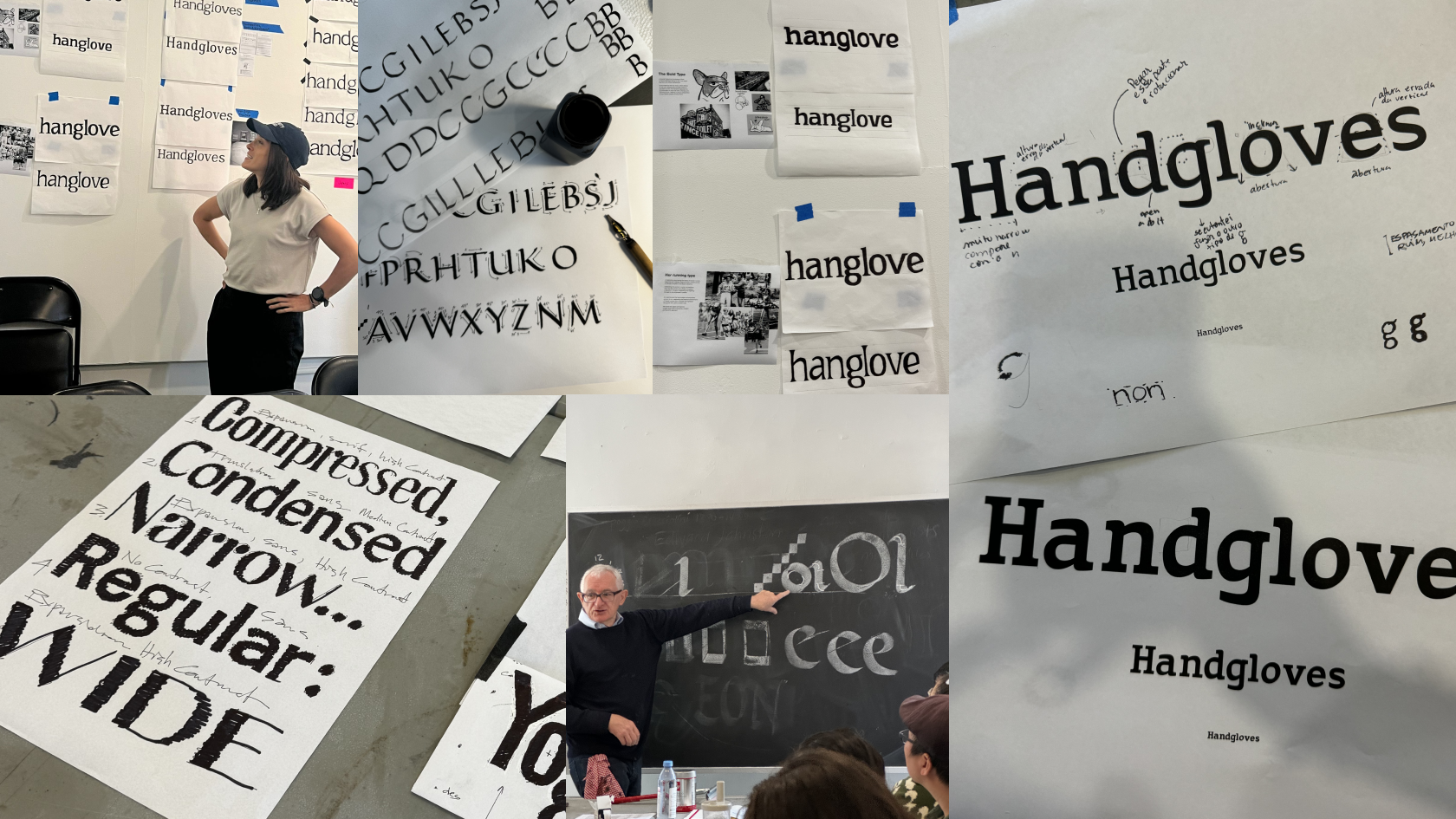
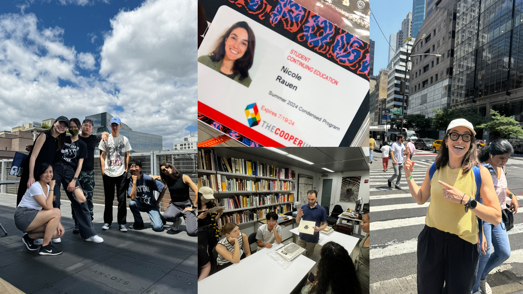
Rauen’s dedication to learning about designing typography led her to a five-week programme at The Cooper Union for the Advancement of Science and Art. Source: Nicole Rauen
What it takes to start designing typography
What started as noticing how nice the letters looked and how different the typefaces quickly evolved into signing up for lettering workshops.
And despite how busy things with work got, Rauen refused to let go of her interest.
“I started not to have much time to focus on lettering or typography, and I was like, ‘Oh my god, I’m just losing something that I’m really passionate about,’ so I knew I needed to change something in my life – I needed to go study this subject,’” she says.
The decision led her to apply to The Cooper Union for the Advancement of Science and Art for a five-week certificate programme in typography.
It easily changed the trajectory of Rauen’s career.
The programme was intensive, integrating the foundations of typeface design, calligraphy, history, and theory. From sketching various designs daily to seeing the hundreds of types throughout New York City, it was an experience like no other.
“We could go everywhere and with the teachers, and they could teach us how the theory we learned is applied to the city in the real world,” says Rauen. “That was the best part.”
By the end of the five weeks, how Rauen approached typefaces had changed tremendously.
Just like how fashion design students can identify the intricacies of a clothing pattern or how photography students are hawk-eyed about framing the shot, Rauen started picking apart typography everywhere she saw them.
That wasn’t all either – her programme also concluded with a typeface design project requiring her to create her own custom font.
The result? A personal, lovingly made typography inspired by Rauen’s French Bulldog named Bold, titled “Boldchie.”

Meet Rauen’s “Boldchie,” a typeface everyone should get on board with. Source: Nicole Rauen
“It adapts the physical and behavioural traits of the dog, translating them into typographic elements: from a sturdy slab serif that mirrors a bulldog’s strong build, to smooth connections and endings that smile, much like Bold’s affectionate and friendly nature,” writes Rauen on her Behance.
“Boldchie is simply a typeface that makes you smile without even realising it,” she concludes.
And if you don’t believe that, an award might change your mind. Rauen’s Boldchie was named the winner of the Student Category in the annual Communication Arts competition. Communication Arts, for those unfamiliar, is a premier magazine and source of inspiration for everyone involved in visual communications.
“Receiving this award of excellence is a mind-blowing recognition,” writes Rauen in her LinkedIn post announcing the win.

Rauen’s award-winning font is inspired by her French Bulldog, Bold. Source: Nicole Rauen
How to design (award-winning) typography
Before joining the programme at The Cooper Union, Rauen leaned towards display types that were outstanding and expressive.
The reason was simple – after all, how expressive can you be when designing typography without losing the basic structure of a letter? How could you change a letter to its utmost without losing the sense of what it is?
After the programme, however, her appreciation for the subtleties came through.
“In text typeface, the most important thing is legibility, and so you can only add just a little flavour to the type so that it looks like there’s something different,” says Rauen. “I think that’s the perfect type – something with just a bit of flair to it.”
Naturally, this is reflected in Boldchie – and it’s intentional too.
“My concept was around my dog. He’s friendly, cute, and his name is Bold, so I wanted to be really authentic and expressive with the details, and I’m really happy with how it turned out,” shares Rauen.
Choosing the right programme and school can change your life – just ask Rauen. Source: Nicole Rauen
So, what advice would she give those who need inspiration to create their own award-winning work of art?
The most basic is talking to people and learning new stories. For Rauen, it’s simply a matter of always being open to learning more so you can invent new and different things. You could do that by going to events, but not just those that revolve around your chosen subject.
“Design comes from outside the world of design,” says Rauen. “Go to a coffee event, a sports event. I even went to a kombucha event once.”
And last but not least, the internet is your pirate’s hoard of treasure. Even before entering the Communication Arts competition, Rauen had always checked in on it to seek inspiration. “That’s something I do – I always look up design competitions and see who won to understand what people like.”
Popular stories
Looking to migrate? These are the 6 best countries to live in as an international student

Barack Obama, Natalie Portman, Neil deGrasse Tyson, and more: Famous Harvard graduates you might not expect

The universities producing the most billionaires in the world, ranked

Seoul to São Paolo: 11 best cities to study abroad for KPOP concert-lovers